Web Solution Master Blog
How to Use Whitespace to Improve Typography?
- Sajjad
- Typography
- 01 Oct, 2026
A stakeholder looks at a new design and asks, "Can we fit more above the fold?" The designer tightens the line height, shrinks the margins, and pulls
Continue Reading
Readability vs. Legibility: What's the Difference?
- Sajjad
- Typography
- 01 Oct, 2026
A support team I worked with kept getting tickets from customers who had typed their license keys wrong. The keys were displayed in a stylish geometr
Continue Reading
How to Create a Clear Typographic Hierarchy on a Web Page?
- Sajjad
- Typography
- 01 Oct, 2026
Open a page that was assembled in a hurry and you will often see the same thing: the headline is 32px, the section headings are 28px, the card titles
Continue Reading
How Typography Affects User Experience and Conversion Rates
- Sajjad
- Typography
- 01 Oct, 2026
A client once asked why their pricing page converted at half the rate of a competitor's when the offer was nearly identical. The layout was fine, the
Continue Reading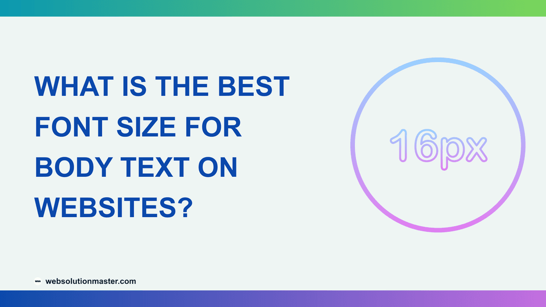
What Is the Best Font Size for Body Text on Websites?
- Sajjad
- Typography
- 01 Oct, 2026
A client reviews their new site on a 14-inch laptop and says it looks great. Their sales director opens it on a phone in a sunny car park and can't r
Continue Reading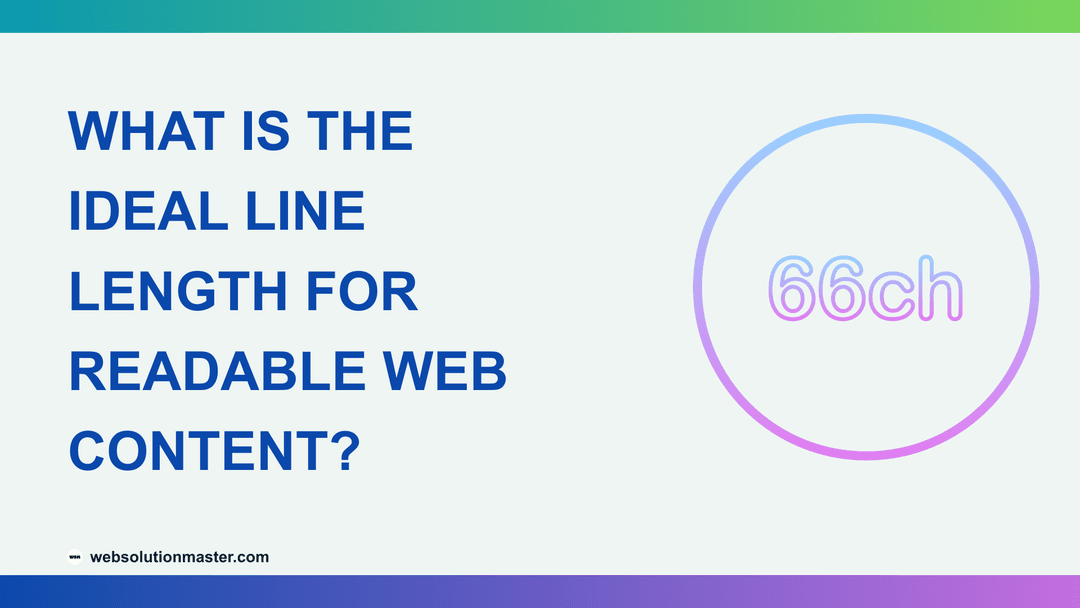
What Is the Ideal Line Length for Readable Web Content?
- Sajjad
- Typography
- 01 Oct, 2026
You open a blog post on a 27-inch monitor and the paragraphs stretch edge to edge, 180 characters per line. By the end of each line, your eyes have t
Continue ReadingCategories
Tags
- Analytics
- Books
- Thriller
- Domestic-thriller
- Fantasy-romance
- Romantasy
- Romance
- Contemporary
- Historical-fiction
- Wwii
- Fake-dating
- Typography
- Southern-fiction
- Dual-timeline
- Dns
- Sports-romance
- Wordpress
- Nextjs
- Website
- Security
- Domain
- Family-drama
- Legal-thriller
- Mystery
- Pi-thriller
- Horror
- Horror-comedy
- Psychological-suspense
- Action-thriller
- Affiliate
- Technology
- Hosting
- Contemporary-romance
- Medical-romance
- Domestic-suspense
- Reviews
- Lcp
- Cache
- Locked-room-mystery
- Romantic-suspense
- Books-about-books
- Server
- Short-story
- Satire
- Small-town-mystery
- Fantasy
- Historical-fantasy
- Dark-romance
- Cold-case-mystery
- Contemporary-fiction
- Western-romance
- Second-chance-romance
- Neurodivergent-narrator
- Steampunk-fantasy
- Domestic-noir
- Road-trip
- Enemies-to-lovers
- Claude-code
- Guide
- Dark-fantasy
- Psychological-horror
- Literary-fiction
- Motherhood