Typography
The History of Web Typography: From Web-Safe Fonts to Variable Fonts
- Sajjad
- Typography
- 01 Oct, 2026
If you built a website in 2005 and wanted a headline in your client's brand typeface, your options were a JPEG of the text, a Flash movie that replac
Continue Reading
How Typography Influences SEO and Content Engagement
- Sajjad
- Typography
- 01 Oct, 2026
A content team spends months producing well-researched articles, earns decent rankings, and then watches visitors bounce. Session recordings show peo
Continue Reading
How to Use Icon Fonts vs. SVG Icons: Which Is Better?
- Sajjad
- Typography
- 01 Oct, 2026
A user with dyslexia installs a browser extension that replaces every font on the web with one she finds easier to read. Suddenly, the navigation on
Continue Reading
How to Use Kinetic Typography Without Overwhelming Users?
- Sajjad
- Typography
- 01 Oct, 2026
A product launch page opens with a headline that types itself out letter by letter, then every section heading slides up and fades in as you scroll,
Continue Reading
Typography Trends Shaping Web Design in 2026
- Sajjad
- Typography
- 01 Oct, 2026
Open ten new startup sites and you will notice they have started to look less alike than they did a few years ago. The era of every product page usin
Continue Reading
Can You Use Commercial Fonts on Your Website Without a License?
- Sajjad
- Typography
- 01 Oct, 2026
You find the perfect typeface for a landing page, check the foundry's price for a web license, and wince. Then you notice the same font is available
Continue Reading
Understanding Font Licensing: What Can You Legally Use?
- Sajjad
- Typography
- 01 Oct, 2026
A client sends you a brand guide that specifies a typeface, along with a ZIP file of OTF files their previous designer "had lying around." You conver
Continue Reading
How to Style Numbers and Data Tables with Tabular Figures?
- Sajjad
- Typography
- 01 Oct, 2026
You build a pricing comparison table, right-align the price column, and it still looks ragged. $1,111.00 is visibly narrower than $8,888.00, the
Continue Reading
How to Style Code Snippets and Technical Typography?
- Sajjad
- Typography
- 01 Oct, 2026
You publish a tutorial, open it on your phone, and the first code block runs off the right edge of the screen. The inline npm install command in th
Continue Reading
How to Display Bengali, Hindi, and Other Non-Latin Scripts on the Web?
- Sajjad
- Typography
- 01 Oct, 2026
A news publisher in Dhaka moves its archive to a new website, and half the Bengali articles render as gibberish like "Avgvi †mvbvi evsjv". The other
Continue Reading
How to Handle Right-to-Left (RTL) Typography in CSS?
- Sajjad
- Typography
- 01 Oct, 2026
The Arabic version of the site launches, and the bug reports arrive within an hour. Paragraphs are right-aligned, but the bullet points sit on the wr
Continue Reading
How to Choose Fonts for Multilingual Websites?
- Sajjad
- Typography
- 01 Oct, 2026
The English site looks great in a display serif the brand team picked. Then the Vietnamese and Polish translations go live, and the headlines turn in
Continue Reading
How to Hand Off Typography from Figma to Developers?
- Sajjad
- Typography
- 01 Oct, 2026
The design review goes badly. The headings look heavier in the browser than in Figma, body text wraps a word earlier on every line, the spacing above
Continue Reading
How to Set Up Typography Tokens in a Design System?
- Sajjad
- Typography
- 01 Oct, 2026
Your product has a marketing site in Next.js, a dashboard in React, an iOS app, and a set of Figma libraries. Somebody bumps the body size from 16px
Continue Reading
How to Use Adobe Fonts on Your Website?
- Sajjad
- Typography
- 01 Oct, 2026
The designer who built your brand used Proxima Nova and Freight Text in every Figma file, synced from their Creative Cloud account. Now the site need
Continue Reading
How to Manage Fonts with the WordPress Font Library?
- Sajjad
- Typography
- 01 Oct, 2026
A site owner wants to try a new headline font for a product launch. A few years ago, that meant filing a ticket, waiting for a developer to download
Continue Reading
How to Change Fonts in a WordPress Block Theme Using theme.json?
- Sajjad
- Typography
- 01 Oct, 2026
A client hands you a brand guide that specifies Source Serif 4 for headings and Inter for body text, and the site runs on a block theme like Twenty T
Continue Reading
How to Use the Tailwind Typography Plugin for Markdown Content?
- Sajjad
- Typography
- 01 Oct, 2026
You render a Markdown blog post into a Tailwind project and every heading looks like body text, the bullet points are gone, links are indistinguishab
Continue Reading
How to Configure Typography in Tailwind CSS v4?
- Sajjad
- Typography
- 01 Oct, 2026
You upgrade a project to Tailwind CSS v4, open the repo, and the tailwind.config.js file where your fontFamily and fontSize extensions used to
Continue Reading
How to Use next/font to Optimize Fonts in Next.js?
- Sajjad
- Typography
- 01 Oct, 2026
Most Next.js projects start with fonts the old way: a link tag to fonts.googleapis.com in the root layout, a pair of preconnect hints, and a `f
Continue Reading
Variable Fonts vs. Static Fonts: A Performance Comparison
- Sajjad
- Typography
- 01 Oct, 2026
A team migrates its marketing site from four static weights to a single variable font, expecting a performance win, and the font payload goes up. Ano
Continue Reading
How to Animate Variable Font Axes with CSS?
- Sajjad
- Typography
- 01 Oct, 2026
The navigation links on a product site thicken smoothly when you hover over them, the hero headline seems to breathe from light to heavy as the page
Continue Reading
How to Use Variable Fonts in CSS?
- Sajjad
- Typography
- 01 Oct, 2026
You download a variable font, drop it into your project, write font-weight: 650 on your headings, and nothing happens. Or worse, the headings rende
Continue Reading
What Are Variable Fonts, and Why Should You Use Them?
- Sajjad
- Typography
- 01 Oct, 2026
Your design system calls for regular text at 400, emphasis at 600, headings at 700, a light 300 for large numbers on the dashboard, and italics for e
Continue Reading
Are Google Fonts GDPR-Compliant?
- Sajjad
- Typography
- 01 Oct, 2026
In late 2022, thousands of small business owners in Germany and Austria opened letters demanding a few hundred euros in "damages" because their websi
Continue Reading
How to Audit Web Font Performance with Lighthouse?
- Sajjad
- Typography
- 01 Oct, 2026
A client sends you a screenshot of their PageSpeed Insights report: performance score 61, LCP 3.9 seconds, and a vague list of warnings. They want to
Continue Reading
What Is a System Font Stack, and When Should You Use One?
- Sajjad
- Typography
- 01 Oct, 2026
You are building an internal admin dashboard. It has forty screens, dense data tables, and users who keep it open all day on Windows laptops and MacB
Continue Reading
How to Use size-adjust and Font Metric Overrides to Prevent CLS?
- Sajjad
- Typography
- 01 Oct, 2026
You have already done the obvious things. Your fonts are self-hosted WOFF2, the body weight is preloaded, and font-display: swap keeps text visible
Continue Reading
How Web Fonts Affect Core Web Vitals and Layout Shift
- Sajjad
- Typography
- 01 Oct, 2026
You ship a redesign with a beautiful new brand typeface, and two weeks later Search Console flags a batch of URLs as "Poor" for Cumulative Layout Shi
Continue Reading
WOFF2 vs. WOFF vs. TTF: Which Font Format Should You Use?
- Sajjad
- Typography
- 01 Oct, 2026
You inherit a WordPress theme and open its stylesheet. Every @font-face rule lists five sources: EOT with a ?#iefix hack, WOFF2, WOFF, TTF, and a
Continue Reading
What Is Font Subsetting, and How Does It Reduce File Size?
- Sajjad
- Typography
- 01 Oct, 2026
You download a font from a foundry for a client's English-language marketing site and drop the WOFF2 into the project. It weighs 310KB. The site's en
Continue Reading
How to Preload Web Fonts the Right Way?
- Sajjad
- Typography
- 01 Oct, 2026
A teammate reads that preloading fonts improves performance, so they add preload tags for every font file in the project: regular, italic, medium, se
Continue Reading
How to Self-Host Google Fonts for Better Performance and Privacy?
- Sajjad
- Typography
- 01 Oct, 2026
You run a WebPageTest on a client's site and the waterfall shows the same pattern on every page. The HTML arrives, the CSS arrives, and then the brow
Continue Reading
What Is FOUT vs. FOIT, and How Do You Avoid Them?
- Sajjad
- Typography
- 01 Oct, 2026
A client sends you a screen recording of their homepage on a phone. For the first second, the headline is set in a chunky Arial that wraps onto three
Continue Reading
What Is font-display, and Which Value Should You Use?
- Sajjad
- Typography
- 01 Oct, 2026
Open a site on a slow train connection and you may stare at a page full of layout with no words in it — buttons, images, empty spaces where the headl
Continue Reading
How to Prevent Orphans and Widows in Web Text?
- Sajjad
- Typography
- 01 Oct, 2026
You publish a landing page and the hero headline reads "Ship faster with fewer bugs in" on the first line and "production" alone on the second. On a
Continue Reading
How to Use the CSS initial-letter Property?
- Sajjad
- Typography
- 01 Oct, 2026
If you have ever built a drop cap with float: left, a large font-size, and a line-height tuned by trial and error, you know the result. It line
Continue Reading
How to Style Lists and Bullets with Modern CSS?
- Sajjad
- Typography
- 01 Oct, 2026
A designer hands you a mockup where every bullet is a small brand-colored dash, the numbered steps use large bold numerals in a circle, and the list
Continue Reading
How to Use CSS Container Queries for Responsive Typography?
- Sajjad
- Typography
- 01 Oct, 2026
You build a product card with a confident 1.75rem heading. It looks great in the three-column grid on the homepage. Then someone drops the same card
Continue Reading
How to Add Text Shadows Without Hurting Readability?
- Sajjad
- Typography
- 01 Oct, 2026
The client's new homepage has a full-bleed photo of a sunlit beach with a white headline set right across the sky. On the designer's mock-up the sky
Continue Reading
How to Use the CSS font Shorthand Property Correctly?
- Sajjad
- Typography
- 01 Oct, 2026
You tidy up a component by collapsing five font declarations into one line: font: bold 1.125rem Inter. It looks cleaner, the linter is happy, and t
Continue Reading
Understanding CSS font-size Units: px, em, rem, vw, and ch
- Sajjad
- Typography
- 01 Oct, 2026
You set a nested list's font size to 0.9em so it looks slightly smaller than body text, and three levels deep the items have shrunk to a barely rea
Continue Reading
How to Use CSS Custom Properties for a Typography System?
- Sajjad
- Typography
- 01 Oct, 2026
You inherit a codebase where the stylesheet contains 43 different font-size values, from 13px to 3.25rem, and nobody can tell you which ones ar
Continue Reading
How to Style Text with CSS Gradients and Background Clip?
- Sajjad
- Typography
- 01 Oct, 2026
The marketing team wants the hero headline to fade from violet to pink, like the one on that SaaS site everybody is copying this year. You add a `lin
Continue Reading
How to Create Drop Caps with CSS?
- Sajjad
- Typography
- 01 Oct, 2026
An editor asks you to make the long-read feature section feel more like a magazine, and the first thing on their list is a large initial letter at th
Continue Reading
How to Use the CSS line-clamp Property to Truncate Text?
- Sajjad
- Typography
- 01 Oct, 2026
Your blog grid looks great in the design file, where every card has a two-line title and a three-line excerpt. Then real content arrives. One editor
Continue Reading
How to Control Hyphenation with CSS?
- Sajjad
- Typography
- 01 Oct, 2026
A German client sends over product copy containing "Kundenzufriedenheitsumfrage," and on a 360-pixel phone screen that single word pushes past the ed
Continue Reading
How to Use the CSS text-wrap: balance and pretty Properties?
- Sajjad
- Typography
- 01 Oct, 2026
You write a hero headline that fits perfectly on your laptop, then open the page on a phone and watch it break into three lines with a single word st
Continue Reading
How to Use CSS font-feature-settings for Advanced Typography?
- Sajjad
- Typography
- 01 Oct, 2026
You licensed a good typeface, loaded it on your pricing page, and the numbers in the comparison table still wobble from row to row because every digi
Continue Reading
How to Build a Modular Type Scale for Your Website?
- Sajjad
- Typography
- 01 Oct, 2026
Open the stylesheet of a site that's been through a few years of edits and search for font-size. You'll often find 20 or 30 distinct values: 13px,
Continue Reading
What Is Fluid Typography, and How Do You Implement It with CSS clamp()?
- Sajjad
- Typography
- 01 Oct, 2026
You've set your H1 at 36px on mobile, 48px on tablets, and 60px on desktops, with media queries at 768px and 1200px. Then someone opens the site on a
Continue Reading
How to Test Typography for Low-Vision Users?
- Sajjad
- Typography
- 01 Oct, 2026
Your site passes Lighthouse with a perfect accessibility score. Then you sit next to a user with macular degeneration while she reads your product pa
Continue Reading
Is All-Caps Text Bad for Accessibility?
- Sajjad
- Typography
- 01 Oct, 2026
A redesign comes back from the agency with a bold new look: navigation in uppercase, every button in uppercase, section headings in uppercase, and a
Continue Reading
How to Support Browser Zoom and User Font Preferences?
- Sajjad
- Typography
- 01 Oct, 2026
A user zooms your marketing site to 200% to read the pricing details. The sticky header, which was a tidy 80px bar, now takes up a third of the scree
Continue Reading
Why You Should Use rem Instead of px for Font Sizes
- Sajjad
- Typography
- 01 Oct, 2026
Open Chrome's settings, go to Appearance, and change "Font size" from Medium to Very Large. Now reload a handful of sites you've built. On some, the
Continue Reading
What Are the Best Fonts for Dyslexic Readers?
- Sajjad
- Typography
- 01 Oct, 2026
A school district asks you to rebuild its parent portal, and one requirement in the brief stands out: "Use a dyslexia-friendly font." Someone on the
Continue Reading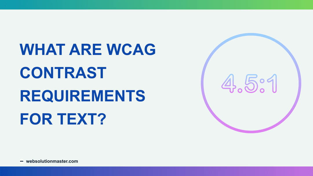
What Are WCAG Contrast Requirements for Text?
- Sajjad
- Typography
- 01 Oct, 2026
Your brand's primary blue looks great on a white button in Figma. Then an accessibility audit comes back and flags every button on the site, along wi
Continue Reading
How to Make Website Typography Accessible?
- Sajjad
- Typography
- 01 Oct, 2026
A client forwards you an email from a customer: "I can't read your pricing page. The text is tiny, gray, and when I zoom in, the menu covers everythi
Continue Reading
How to Design Readable Typography for Mobile Screens?
- Sajjad
- Typography
- 01 Oct, 2026
You open your own site on a phone while standing on a train. The headline wraps into five lines and pushes the first paragraph below the fold, the bo
Continue Reading
How to Style Blockquotes and Pull Quotes Effectively?
- Sajjad
- Typography
- 01 Oct, 2026
You publish an interview with a customer and want their best line to jump off the page. You wrap it in a blockquote, the browser indents it 40px on
Continue Reading
Why Justified Text Is Usually a Bad Idea on the Web
- Sajjad
- Typography
- 01 Oct, 2026
A designer hands you a mockup where every paragraph forms a crisp rectangle, both edges perfectly straight, like a printed magazine. You add `text-al
Continue Reading
How to Use Font Weight to Guide Reader Attention?
- Sajjad
- Typography
- 01 Oct, 2026
Look at a pricing table where the plan names, the prices, the feature lists, and the footnotes are all set in the same 400 weight. Your eye has nowhe
Continue Reading
How to Format Headings for Scannable Content?
- Sajjad
- Typography
- 01 Oct, 2026
Picture a developer landing on your documentation page from a search result. They are looking for one thing: how to configure a single option. They w
Continue Reading
Common Typography Mistakes That Hurt Your Website
- Sajjad
- Typography
- 01 Oct, 2026
Every few months I audit a site that looks great in the design file and feels tiring in the browser. The fonts are well chosen, the colors are on-bra
Continue Reading
How to Style Long-Form Articles for Better Readability?
- Sajjad
- Typography
- 01 Oct, 2026
You spend two weeks researching and writing a 4,000-word guide. Analytics later show that the median reader scrolls 30% of the way and leaves. The co
Continue Reading
How to Use Whitespace to Improve Typography?
- Sajjad
- Typography
- 01 Oct, 2026
A stakeholder looks at a new design and asks, "Can we fit more above the fold?" The designer tightens the line height, shrinks the margins, and pulls
Continue Reading
Readability vs. Legibility: What's the Difference?
- Sajjad
- Typography
- 01 Oct, 2026
A support team I worked with kept getting tickets from customers who had typed their license keys wrong. The keys were displayed in a stylish geometr
Continue Reading
How to Create a Clear Typographic Hierarchy on a Web Page?
- Sajjad
- Typography
- 01 Oct, 2026
Open a page that was assembled in a hurry and you will often see the same thing: the headline is 32px, the section headings are 28px, the card titles
Continue Reading
How Typography Affects User Experience and Conversion Rates
- Sajjad
- Typography
- 01 Oct, 2026
A client once asked why their pricing page converted at half the rate of a competitor's when the offer was nearly identical. The layout was fine, the
Continue Reading
What Is the Best Font Size for Body Text on Websites?
- Sajjad
- Typography
- 01 Oct, 2026
A client reviews their new site on a 14-inch laptop and says it looks great. Their sales director opens it on a phone in a sunny car park and can't r
Continue Reading
What Is the Ideal Line Length for Readable Web Content?
- Sajjad
- Typography
- 01 Oct, 2026
You open a blog post on a 27-inch monitor and the paragraphs stretch edge to edge, 180 characters per line. By the end of each line, your eyes have t
Continue Reading
How to Pick a Monospace Font for Code Blocks and Documentation?
- Sajjad
- Typography
- 01 Oct, 2026
A user copies an API key from your documentation, pastes it into their terminal, and gets an authentication error. They try again. Same error. Eventu
Continue Reading
Classic Typefaces Every Web Designer Should Know
- Sajjad
- Typography
- 01 Oct, 2026
A creative director says "make it feel more Swiss," or "something like a Caslon, but for screens," or "less Futura, more Gill." If those references d
Continue Reading
How to Find the Name of a Font from an Image?
- Sajjad
- Typography
- 01 Oct, 2026
A client sends you a photo of a café menu with the note "we want our new site to feel like this." Or a designer drops a screenshot of a competitor's
Continue Reading
Free vs. Premium Fonts: Is Paying for a Typeface Worth It?
- Sajjad
- Typography
- 01 Oct, 2026
A client asks why the agency's quote includes $1,800 for "font licensing" when Google Fonts has 1,700 families for nothing. It's a fair question, and
Continue Reading
How to Choose Fonts for Dark Mode Interfaces?
- Sajjad
- Typography
- 01 Oct, 2026
You ship a dark theme by inverting your color tokens: white background becomes near-black, near-black text becomes white. Everything technically pass
Continue Reading
Display Fonts vs. Text Fonts: Knowing When to Use Each
- Sajjad
- Typography
- 01 Oct, 2026
You find a gorgeous typeface on a foundry's specimen page. The hero shows it at 120 pixels, tightly spaced, with hairline serifs that look like they
Continue Reading
How Many Fonts Should a Website Use?
- Sajjad
- Typography
- 01 Oct, 2026
Open the Network panel on a typical small-business website and filter by "Font." It's common to see a dozen requests: three families from Google Font
Continue Reading
How to Choose Typography for a SaaS Landing Page?
- Sajjad
- Typography
- 01 Oct, 2026
You have about five seconds. A visitor lands on your SaaS homepage from a Google ad, scans the headline, glances at a product screenshot, looks for a
Continue Reading
How to Choose Fonts for an E-commerce Website?
- Sajjad
- Typography
- 01 Oct, 2026
A fashion store relaunches with a beautiful thin serif across the whole site. The homepage looks like a magazine cover. Then the support tickets star
Continue Reading
The Best Google Fonts for Headlines and Display Text
- Sajjad
- Typography
- 01 Oct, 2026
The hero section is the first thing every visitor sees, and the headline is usually the biggest thing in it. Set it in the same font as your body tex
Continue Reading
The Best Google Fonts for Body Text in 2026
- Sajjad
- Typography
- 01 Oct, 2026
Google Fonts has more than 1,800 families. Filter by "Sans Serif" or "Serif" and you still get hundreds, most of which look perfectly readable in the
Continue Reading
How to Choose a Font That Matches Your Brand Personality?
- Sajjad
- Typography
- 01 Oct, 2026
A boutique accounting firm wants its new website to feel "approachable but trustworthy." The first design round uses a rounded, bubbly sans because i
Continue Reading
How to Pair Fonts: Rules for Combining Two Typefaces
- Sajjad
- Typography
- 01 Oct, 2026
You've chosen a body font you like, and now you need something for headings. You scroll through Google Fonts, try a dozen candidates, and each one lo
Continue Reading
What Is a Vertical Rhythm, and How Do You Build One?
- Sajjad
- Typography
- 01 Oct, 2026
You inherit a blog template where every gap was set by eye. Paragraphs have margin-bottom: 18px, headings have margin-top: 37px, lists sit 12px f
Continue Reading
What Are Glyphs, and How Do They Differ from Characters?
- Sajjad
- Typography
- 01 Oct, 2026
A product name field limits input to 20 characters. A customer in Bangladesh types their shop name in Bengali, and the form rejects it even though it
Continue Reading
What Is Optical Sizing in Typography?
- Sajjad
- Typography
- 01 Oct, 2026
You pick an elegant high-contrast serif for a magazine-style site. At 64px in the hero headline it looks superb: hairline serifs, crisp thin strokes,
Continue Reading
What Are Ligatures, and Should You Use Them on the Web?
- Sajjad
- Typography
- 01 Oct, 2026
A client sends a screenshot: the word "office" in their new headline looks like it has a strange joined letter in the middle, and a user has complain
Continue Reading
What Is a Type Family, and How Many Weights Do You Need?
- Sajjad
- Typography
- 01 Oct, 2026
You open the Google Fonts page for Inter, click "Get font", and the embed code asks for every weight from 100 to 900, in both upright and italic. You
Continue Reading
Ascenders, Descenders, and Baselines: The Anatomy of a Letterform
- Sajjad
- Typography
- 01 Oct, 2026
You align an icon next to a button label and it looks a pixel or two too high, no matter how you adjust vertical-align. You set overflow: hidden
Continue Reading
What Is X-Height, and Why Does It Matter for Screen Fonts?
- Sajjad
- Typography
- 01 Oct, 2026
You swap a site's body font from Inter to EB Garamond, keep font-size: 1rem, and suddenly the text looks noticeably smaller and harder to read — ev
Continue Reading
What Is Leading, and How Do You Set the Right Line Height?
- Sajjad
- Typography
- 01 Oct, 2026
You launch a redesign and the article pages look fine on your laptop, but readers on phones complain that paragraphs feel like "walls of text." You c
Continue Reading
What Is Tracking (Letter-Spacing) in Typography?
- Sajjad
- Typography
- 01 Oct, 2026
You copy a design from Figma into code, and the 72px hero headline looks loose and baggy compared with the mockup. Meanwhile, the small all-caps "NEW
Continue Reading
What Is Kerning, and How Does It Affect Readability?
- Sajjad
- Typography
- 01 Oct, 2026
You set a big hero headline that reads "WAVE TOURS" and something feels off. There is a gaping hole between the W and the A, another between A
Continue Reading
What Are Monospace Fonts, and Where Do They Work Best?
- Sajjad
- Typography
- 01 Oct, 2026
You paste a YAML config into a blog post and the indentation that made it valid now looks ragged. You build a pricing table and the dollar amounts wo
Continue Reading
What Is a Slab Serif Typeface?
- Sajjad
- Typography
- 01 Oct, 2026
You are designing a site for a coffee roaster, a hardware brand, or a local newspaper, and every serif you try feels too delicate while every sans-se
Continue Reading
What Are Serif and Sans-Serif Fonts, and When Should You Use Each?
- Sajjad
- Typography
- 01 Oct, 2026
You are building a site for a law firm and someone in the meeting says, "Serif fonts are for print, sans-serif is for screens — everyone knows that."
Continue Reading
Typeface vs. Font: What's the Difference?
- Sajjad
- Typography
- 01 Oct, 2026
A client emails you: "Can we change the font on the blog to something bolder?" Do they want a different typeface entirely, or just the bold weight of
Continue Reading
What Is Typography, and Why Does It Matter in Web Design?
- Sajjad
- Typography
- 01 Oct, 2026
Open two landing pages that sell the same product at the same price. One uses 14px light-grey text stretched across a 1,400px-wide column, three diff
Continue Reading
Web Typography Choosing the Ideal Font for Your Website
- Sajjad
- Typography
- 18 Jul, 2023
When it comes to web design, one of the most critical elements to consider is typography. The right font can enhance the overall user experience, con
Continue Reading